Mais Saúde Hub
From a generic experience to personalized health journeys that drive adoption, recurrence and revenue on the Raia and Drogasil apps.
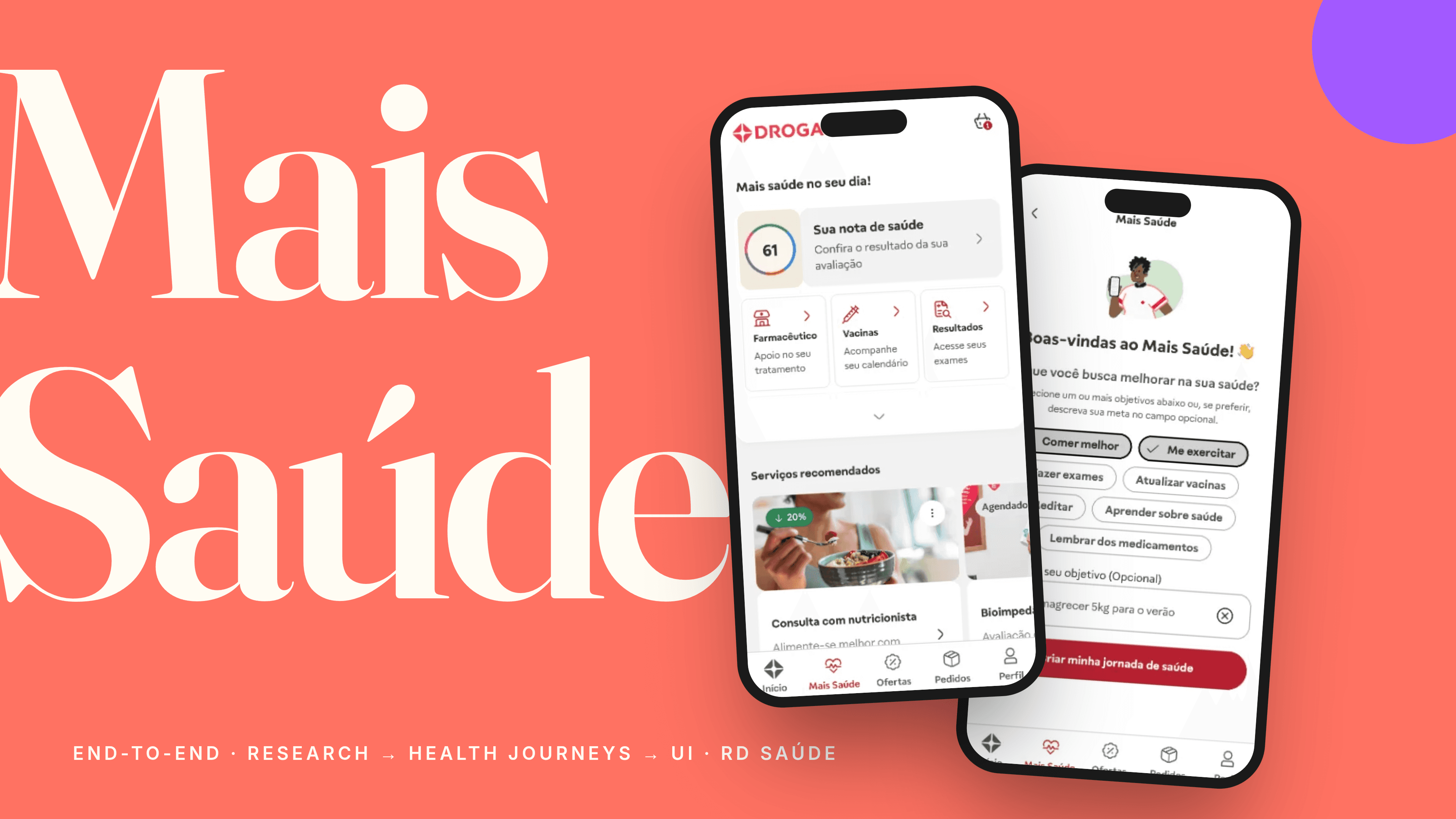
From two separate products to a health hub inside Brazil's largest pharmacy network
Vitat was born as an independent health and wellness app focused on wellness and B2C. In 2024, after a rebrand focused on primary care, it was integrated into the Raia and Drogasil apps as the Mais Saúde tab — creating a health services hub for millions of users. The promise was to connect continuous care with pharmacy convenience.
But initial data and research showed the experience was not delivering this: 18% activation, weak CTR and consistent feedback that the tab felt generic and purposeless.
"The feeling that when I answer, you're going to give me something personalized. But the result wasn't personalized. It felt like a newly launched app."— Client A, initial qualitative research
End-to-end co-leadership: from strategy to impact
I worked in co-leadership with PM and Tech Lead, responsible for all design decisions — not just the interface, but defining hypotheses, success metrics, feature prioritization and negotiating trade-offs with stakeholders.
My responsibilities covered the full cycle: continuous discovery, research synthesis, translating insights into hypotheses, prototyping, A/B testing, handoff, bug-bash and post-launch impact tracking. I was also responsible for mentoring junior designers and evolving the Vitat design system.
Four problems feeding each other
Users arrived and did not know where to start. Without a clear next step, there was no habit formation or return.
Everything felt generic until after a lot of effort. Value was not clear in the first seconds — the critical retention moment.
Without a defined anchor segment, the roadmap became a demand dispute. Subjective prioritization, hard to justify to stakeholders.
Mixed KPIs prevented proving impact and scaling what worked. Decisions relied on intuition, not data.
Three simultaneous research fronts
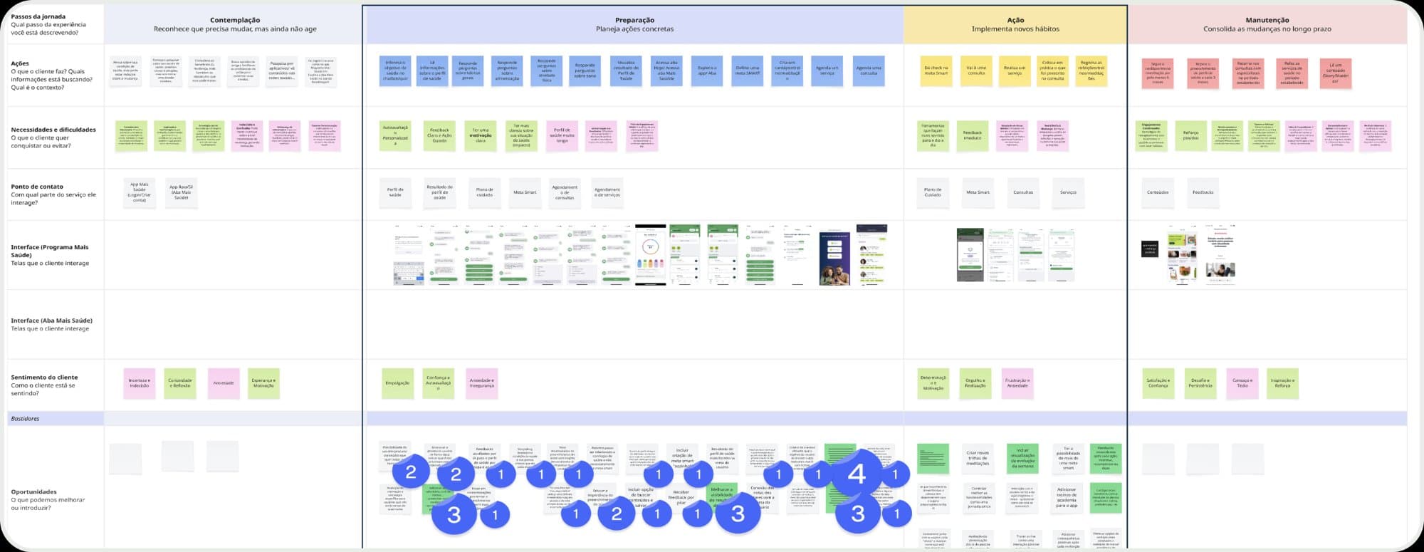
I structured discovery across three parallel fronts — each with specific questions, methods and outputs — to ensure hypotheses were grounded in multiple evidence sources before any design decision.
Funnel analysis, abandonment maps and behavioral patterns in the app. Findings: 39% never accessed the tab, 58% did not remember it existed, only 7% completed their Profile.
Interviews, NPS and usability tests to understand what built trust. Findings: 85% did not understand the benefits, 50% expected immediate personalization after filling their Profile. Profile completers had 70% CTR — vs 13% without profile.
Stakeholder alignment to understand which segment sustains recurrence. Output: chronic user as the highest engagement profile + identification of sponsorable journeys with the pharmaceutical industry (GLP-1).
Before designing, define what we'll measure
One of the most important decisions was defining KPIs before prototyping. Each hypothesis had clear validation metrics — making design decisions more objective and conversations with PM and stakeholders more evidence-based than opinion-based.
Measure: activation (1st click), CTR on first modules, completion of "first step". Intervention: welcome Bottom Sheet + micro-anamnesis.
Measure: profile completion, CTR on personalized recommendations, engagement per module. Intervention: next step highlight + pharmacy shortcuts.
Measure: D7/D30 return, condition adherence, service conversion, partnership revenue. Intervention: journeys sponsored by the pharmaceutical industry.
We used FigmaMake for testable prototypes and A/B tests before development — reducing validation cost and accelerating learning.
Three interventions, each with a hypothesis, metric and result
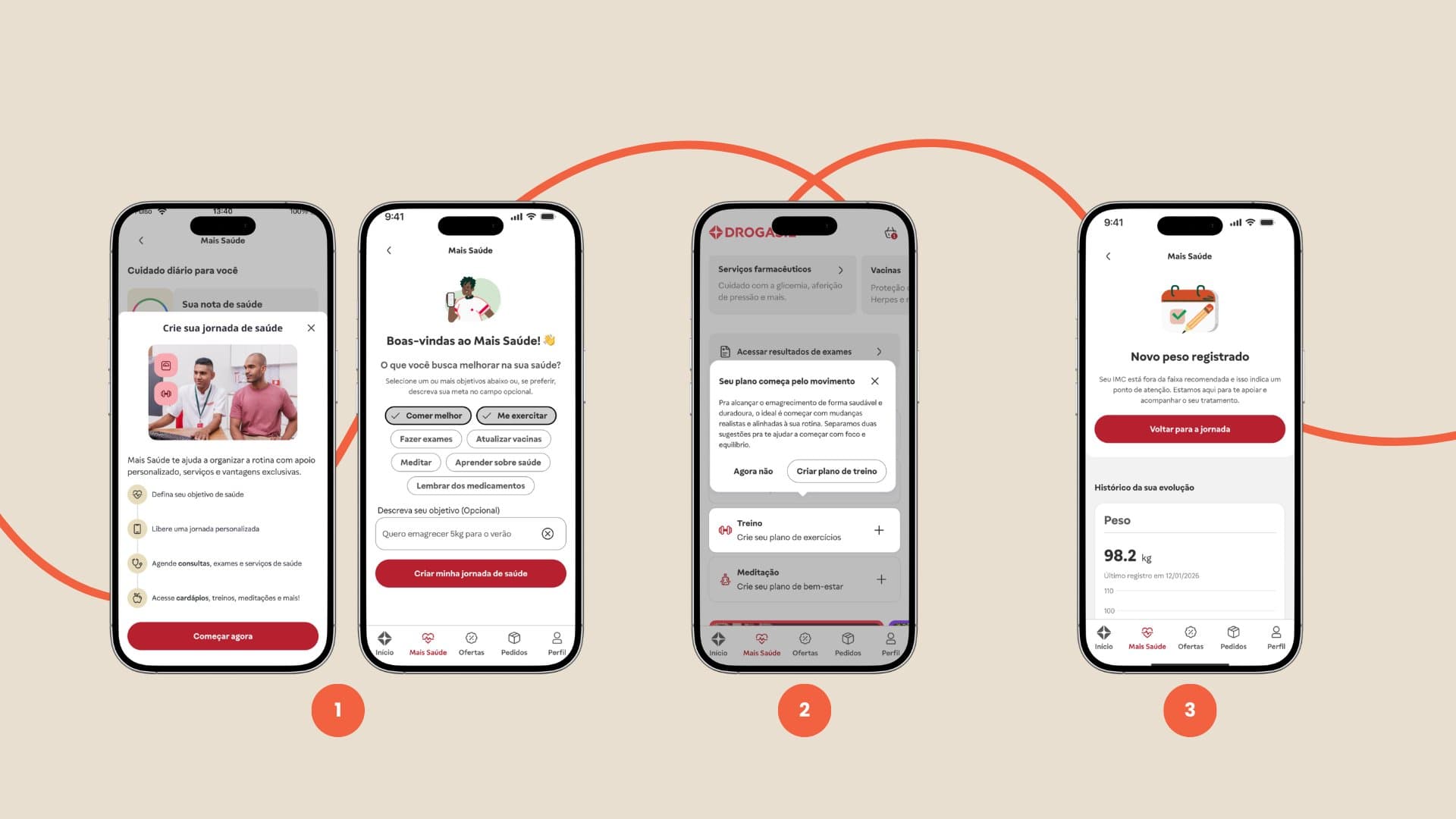
Users arrived without context — they did not know what the tab was, what they could do or where to start. We designed a welcome Bottom Sheet with micro-anamnesis to collect health goals in a few clicks, generating immediate personalization. A/B validated before development. Result: +20% activation.
Even with personalization available, users with a complete profile had only 13% CTR — the value was not visible. We redesigned the tab home with a dynamic next-step highlight and contextual shortcuts to pharmacy services. Result: CTR 13%→70%, +40% overall CTR, +16% engagement.
With the anchor segment identified, we designed condition-specific journeys sponsored by the pharmaceutical industry. The GLP-1 pilot connected continuous care, medication reminders and pharmacy services in a single experience. Result: 80% follow the recommendation.
Handoff, bug-bash and continuous tracking
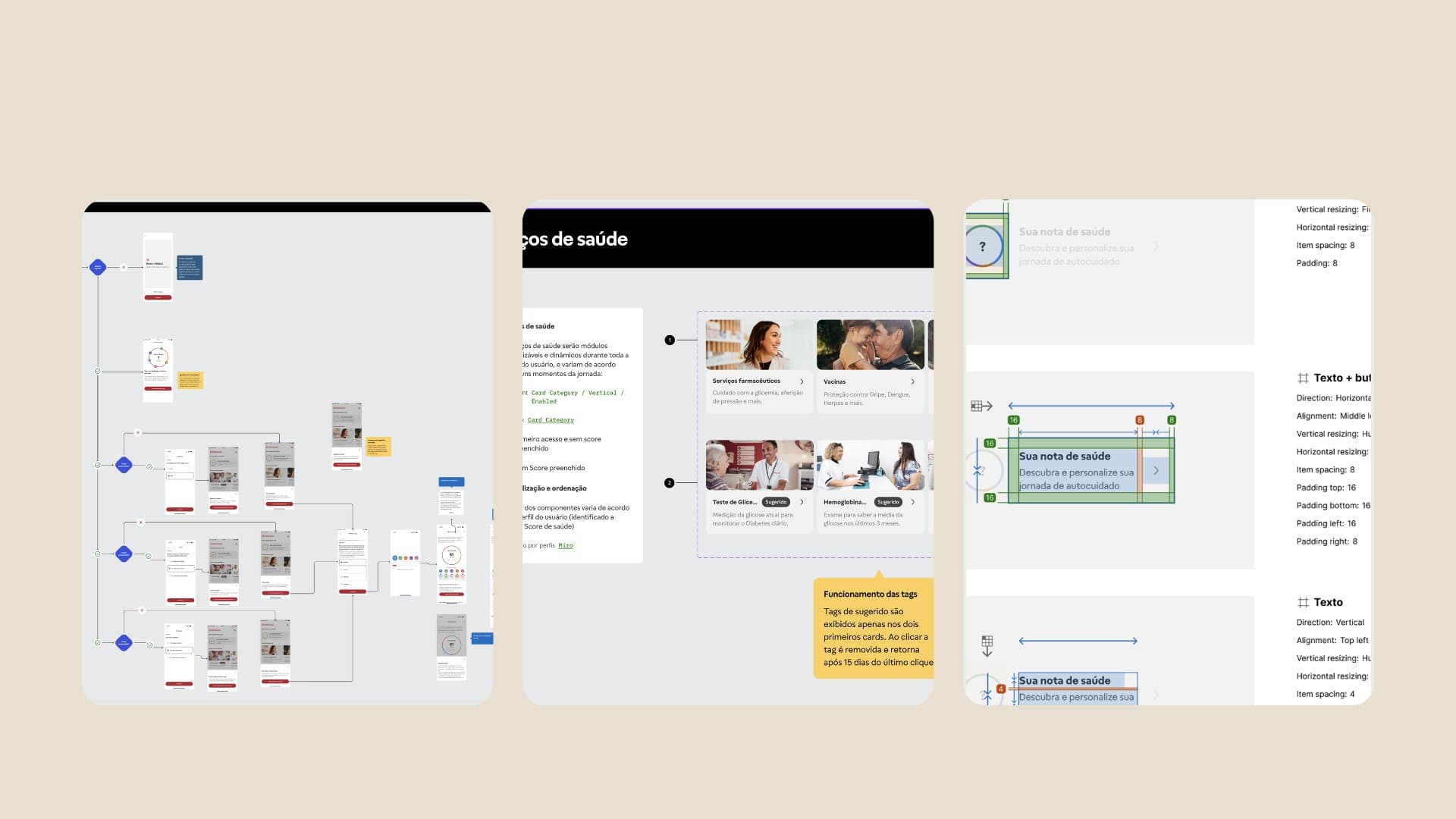
Handoff was done with detailed flow specifications, states and edge cases in Figma. I participated in the bug-bash with development before launch — ensuring the delivered experience was the designed experience. After launch, I tracked KPIs weekly and maintained short discovery cycles to identify new friction points and opportunities.
Measured impact
What I would do differently
I would define the anchor segment earlier. We tried to solve for all profiles at once. It was only when we identified the chronic user as the highest recurrence profile that decisions became clearer and more assertive. This should have been step zero.
I would accelerate KPI instrumentation. Before prototyping, align exactly what we will measure, who is responsible and what the success threshold is. This transforms the conversation with PM and stakeholders — from opinion to evidence.